AUC – Corporate Website
The American University of the Caribbean School of Medicine (AUC) is a private medical school. Its main primary science campus is in Saint Maarten, and separate administrative offices are located in Iselin, New Jersey, and Miramar, Florida, in the United States.
ClientWeymouth Design / American University of CaribbeanIndustryEducationMy roleLead DesignerYear2011

In 2011, I got the opportunity to work on this project via a design agency in Boston called Weymouth Design.
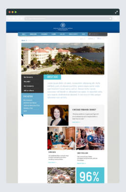
The client wants to re-design their current website to something more modern and primarily used for admission. The goal is to attract more students from the US region, Canada, and other countries. AUC’s best selling points are its location in the sunny Caribbean and its high-ranking statistics.
The Problems
The old site was built by AUC internal team based on Drupal CMS. The site architecture is not very well organized and not purposely designed for any target users. The user interview results often came with the complaints that there is so much overwhelming documented information on the site. However, it is still challenging to find the information they want.
The Solutions
After going thru the Research & Exploration phase, we decided to design & build the site in two versions:
- A mini version for Mobile devices, and
- The main website for Desktop
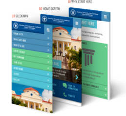
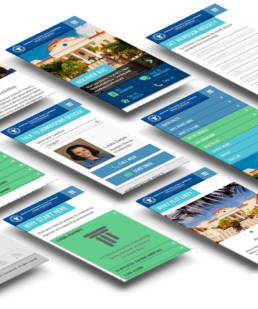
At the time, responsive design practice was around the corner, but it was still not yet mainstream. The website version for a mobile device is quite an edgy approach at that time. The mobile version is specifically designed for Admission purposes, where the prospective student could find Admission info, Viewbook, Leave a Message, Make Phone Calls, etc…
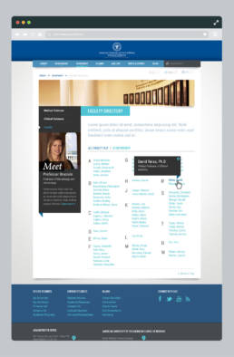
For the leading site, I worked very closely with the UX architecture; basically, we went thru and mapped out the old site structure and started to restructure the information for a smoother digested to the target users, including prospect students, current students, alumni, and investors.
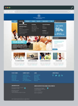
We decided to use mega-dropdown and mega-footer to enhance the navigation capability.
The homepage is redesigned to be better digested for groups of users, utilizing the highlight feature and carousel feature.
